Website Optimization: 18 Strategies to Boost Sales and Traffic in 2024
If you’re looking to boost sales, increase website traffic, and improve conversions on your website, there are numerous optimization techniques you can implement. Simply put, website optimization is the process of improving your website’s performance.
As a loyal reader of IncomeDiary.com, I wouldn’t want you to miss out on valuable tips and tricks that could significantly impact your website’s success. That’s why I’ve compiled a comprehensive list of the best website optimization lessons you can learn today.
As an online entrepreneur and website owner, it’s essential to keep up with the latest trends in internet marketing to avoid being left behind.
My approach to website optimization is to focus on what gets the most results with the least amount of work. It often seems like those who are unsuccessful have it the other way round, focusing on things that just don’t matter.
I hope you find these tips helpful. If you know of any additional blog posts worth featuring, please share them in the comments section below, and we’ll add them to the list!
What are the most important website optimization techniques?
When you have spent a lot of time working on your website and your traffic is still low, your sales page won’t convert, and no one shares your content, you must look at your website and determine where you are failing. Below are the most important elements in terms of optimizing your website:
- #1 Reduce Your Website Bounce Rate
- #2 Optimize Your Website For Search Engines
- #3 Conduct a website audit
- #4 Increase Your Website Speed
- #5 Optimize Your Email Marketing Signup Area
- #6 Offer Amazing Customer Service
- #7 Add Upsells To Your Sales Funnel
- #8 Increase Your Affiliate Sales With Coupon Codes and Comparison Tables
- #9 Increase Your Income By Using Multiple Monetization Techniques
- #10 Keep Your Website Up To Date
- #11 Make Sure Your Blog Is Secure!
- #12 Optimize Your Website Design
- #13 Optimize Your Website Code
- #14 Improve Your Website Credibility
- #15 Improve Your Website Content
- #16 Split Test Your Website
- #17 Optimize Your Website Design for Mobile Devices
- #18 Tracking and Analyzing Your Traffic
18 Ways Website Optimization Can Increase Your Sales and Traffic
#1 Improve User Experience And Reduce Bounce Rate
Monitoring your website’s bounce rate is essential to enhancing its user experience. The bounce rate indicates the percentage of visitors who exit your website without exploring beyond the initial landing page. The lower the bounce rate, the better your website’s performance.
Website user experience is a user’s overall experience while using a website. It encompasses various aspects such as ease of navigation, page speed, mobile-friendliness, and visual appeal.
A good user experience can help a website achieve its goals by increasing traffic, engagement, and conversion rates. On the other hand, a poor user experience can drive users away and harm a website’s reputation. Google has identified user experience as a key ranking factor, indicating its importance in search engine optimization. To improve website user experience, you basically just have to follow a lot of the advice that we are going to share in this article about website optimization, such as:
- Use clear and concise language.
- Optimizing page speed.
- Make sure that your website is mobile-friendly.
- Provide easy navigation.
- Use high-quality images and videos.
- Use a clear call to action.
- Minimizing pop-ups.
- Provide customer reviews.
- Improve your website security.
- Have a comments section below the articles.
- Interlink blog posts
- Reduce adverts
- Improve readability
- Keep content up to date
- Add related or popular posts to the bottom of articles
- Test different anchor text for website navigation
- Reorder posts on category pages to show the most popular first.
By considering these factors, website owners can improve the user experience, reduce bounce rate, and create a website that is helpful and engaging for their users.
#2 Optimize Your Website For Search Engines
Search engine optimization is one of the best ways to spend your time if you want to increase traffic to your site. With literally millions of other people and blogs to compete with; you have to work hard to stay ahead of the game.
So many people manage to cover most areas of importance when starting a blog with the exception of SEO. This can be disastrous for the future of your blog and because of this, you need to learn as much as you possibly about the subject.
Get clued up on the best SEO tools and techniques, this will put you one step ahead of the competition!
Here are my top tips that I focus on when it comes to optimizing my website for search engines:
- Conduct keyword research
- Reduce bounce rate
- Fix broken links
- Increase page speed
- Make sure ever page has more than 2000 words
- Get more backlinks
- Add a sitemap
- Reduce image size – making the website load faster. [The TinyImage tool is great for this]
From this list, you will probably notice that search engine optimization isn’t just about writing great content, but it’s also a lot about how user-friendly your website is. It makes sense, the better your website is, the more Google wants to link to you. To discover keywords, find broken links and other errors, we are using SEMrush’s free SEO audit tool. More about this in the next section.
#3 Conduct a Website Audit
It is the easiest way to discover how to make improvements on your website for higher conversions and more search engine traffic.
A website audit is basically the task of looking at how your website functions, all the errors, the linking between pages, and any other things you may have missed.
You used to have to do a website audit all by yourself. Now, all you have to do is use a free audit tool, type in your URL, and it will tell you everything and explain what you need to do to resolve issues.
We use SEMrush, a free SEO tool. I am really impressed with it, mainly because of how user-friendly it is. I remember other tools being better back in the day, but right now, SEMrush is the best.
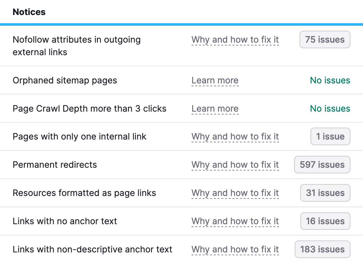
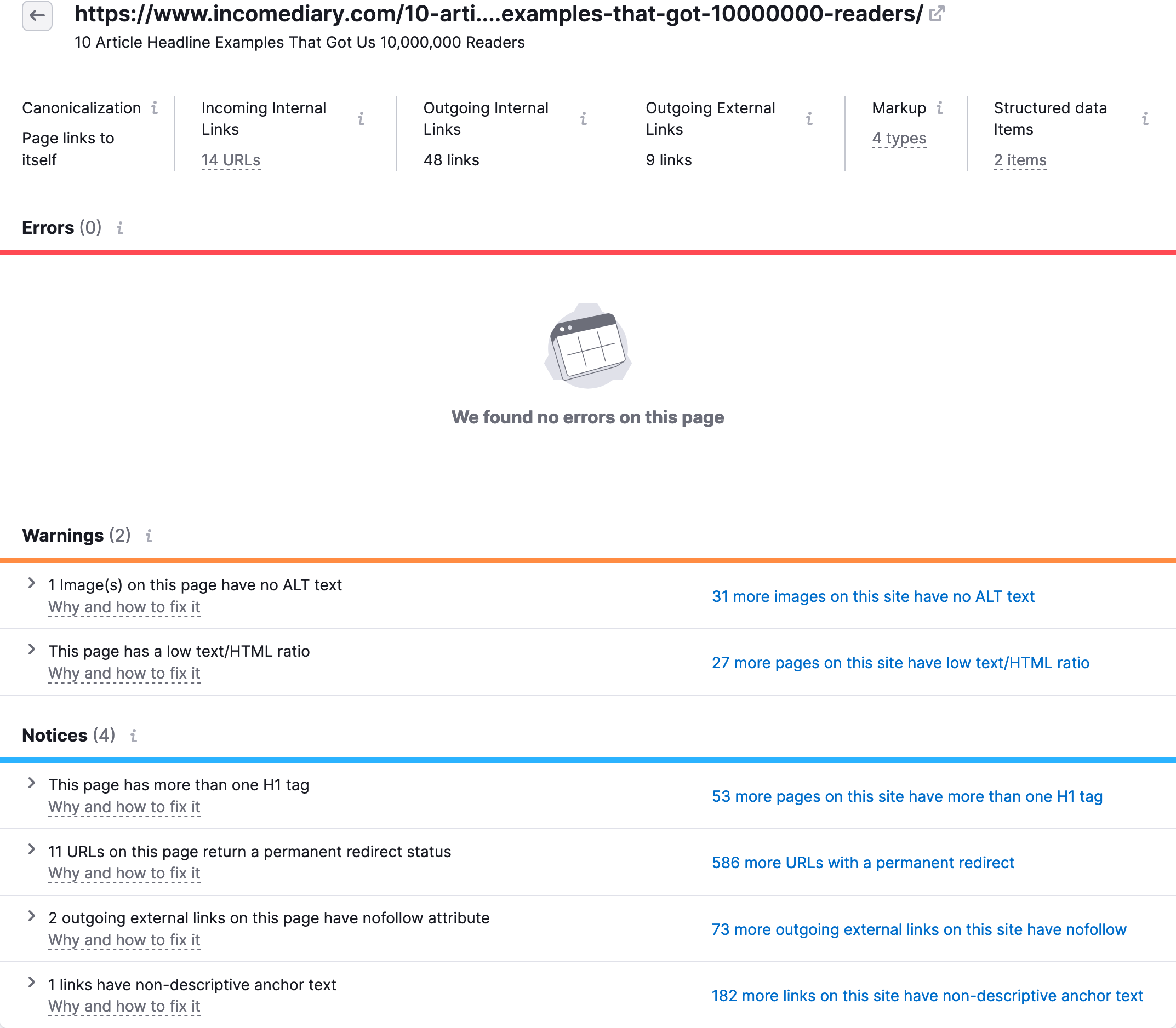
Below is a closer look at the audit tool in action. You will see what errors each page has. Once you fix them, your website will function better than before, increasing conversions and search traffic.
#4 Increase Your Website Speed
It’s surprising how many people overlook the importance of improving website speed, especially regarding increasing conversions and search engine rankings. Instead, they focus on creating pages and posts without considering how their site’s performance affects its speed. But it’s important to remember that a slow-loading website can significantly impact user experience and drive away potential visitors.
Think about it: Have you ever found yourself waiting for a website to load, only to eventually give up and click the “Back” button to search for something else? Your readers are no different. Prioritizing website speed is crucial to keeping your visitors engaged and enhancing their overall experience.
Several website optimization techniques can help you improve your website’s performance and user experience. Some of the best techniques include:
- Optimizing images and videos to reduce page loading times
- Caching frequently accessed pages and files to speed up page load times
- Minimizing HTTP requests by reducing the number of files loaded on a page
- Using a content delivery network (CDN) to distribute your website’s content across multiple servers
- Optimizing your website’s code and scripts to reduce their size and improve load times
- Using browser caching to store frequently accessed files locally on a user’s device
- Minimizing the use of third-party scripts and plugins that can slow down your website
These optimization techniques can help improve your website’s speed, performance, and user experience, increasing website traffic, engagement, and conversions.
#5 Optimize Your Email Marketing Signup Area
This is another major question that a lot of new bloggers ask and while it is a valid and important question it is also very simple to put into effect. Some bloggers give up when they are unable to find new subscribers and this should not be the case, instead, it should make you even more passionate about your blog because you want it to be the best it can be.
Subscribers are definitely the way forward for numerous reasons and loyal ones will aid you greatly whether by spreading the word about your blog by mouth or by a review on your site or maybe even a YouTube video, there is no question that subscribers are the life support that your blog needs in order to stay top of the ladder.
Our top tip for getting email subscribers? how we use Omnisend.
So you have created your blog, you have traffic heading to it on a daily basis and you have even started to build up an email list; how do you go about marketing via email? These great posts should help:
- 5 Different Ways To Get Email Subscribers – What Converted Best?
- 12 Powerful Tips to Dramatically Increase Email Open Rate
#6 Offer Amazing Customer Service
Customer service pays for itself in so many different ways.
Firstly, it will increase your conversion rate because it’s something people care about when they buy a product. If a customer has a problem with your service, they want to know that they can get help straight away, not wait days for each support response. Given the option between two similar products, one with live support, I’m going to take the one with live support.
Secondly, if your customer service is amazing, customers will cancel and refund a lot less.
And thirdly, if your customer service is amazing, they will buy more products from you.
Our support hours are weekly from 7 am till 10 pm GMT. We offer email support, live chat and we have documentation for our software. It’s important to us that you are happy.
#7 Add Upsells To Your Sales Funnel
Launching your own product is a great way to make more money online.
To make even more money from your products, add upsells. An upsell is a one-time offer that is shown directly after they purchase your product. If you get this right, you can double you income with this one tip alone.
When we first launched PopUp Domination, we had no upsells. After a few months, we noticed that our customers were requesting multi-site licenses and more popup designs, so we started selling them. But what made the biggest difference was adding them as an upsell, directly after they purchase.
Think about it, they already put their credit card details in, they are in buying mode, converting someone to buy something right after they bought your product, is a lot easier than doing it later. This one change saw us increase sales by 100%.
#8 Increase Your Affiliate Sales With Coupon Codes and Comparison Tables
Affiliate marketing is a great way to monetize your blog.
When it comes to increasing affiliate sales, some of the best advice I can give you is to offer a coupon code. Customers like to think they are getting a good deal and if they see a coupon, they will think they are getting a better deal.
Another reason why this will boost conversions is that often when someone goes to buy and lands on the checkout page, they see a coupon code field. This makes them think, I could get a better deal if I could get a coupon code for this product. So they go to Google and find a coupon and end up buying through someone else’s link. You can prevent this by giving them the coupon code in the first place.
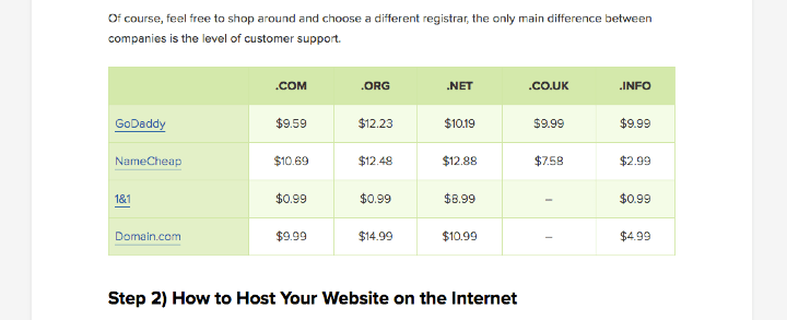
The other big thing I suggest is to show a comparison of prices and features. This lets them see that your recommendation is the best choice and if they decide to use a different product, you will also earn.
#9 Increase Your Income By Using Multiple Monetization Techniques
It’s important to diversify your income in order to make more of it, it sounds simple and in reality, it is a simple thing to do; however, there are a lot of people out there blogging that simply stay focused on just one stream of income and this can be detrimental to what they are trying to achieve. Maybe you are one of these people? Have you started to make money in one certain way and just stuck to that technique?
If you have I commend you in taking action and giving yourself a great head-start; the problem is that you are too focused on that one stream of income to see that there are probably a dozen other ways to make even more money online. Some of those ways may even be 100% more effective.
Read: 10 Ways To Actually Make Money From a Website
#10 Keep Your Website Up To Date
Keeping your website up to date will improve your search engine rankings, reduce your bounce rate and increase conversions.
No one wants to read outdated blog posts.
No one wants to buy a product they don’t think is still relevant. Everyone coming to your website wants to know that your site is the best and it’s worth them spending time on it.
Here are a few things you need to make sure are kept up to date:
- Copyright date
- Mentions of dates in posts
- Blog content
- Fix broken links
- Keep social media accounts up to date
#11 Make Sure Your Blog Is Secure
Hackers, Spammers they are all out to get you, no matter who you are, what niche your blog is involved in or even how long you have been online. It can feel as though it is a personal vendetta against you but don’t take it personally it happens to the best of us.
This is why it is important to look after the security of your blog so that you can continue to give your readers valuable content without being constantly attacked by an unknown force. Spammers are constantly sending emails to just about every blog on the planet and although they in themselves are not damaging, the messages that they can leave all over your blog can be.
#12 Optimize Your Website Design
This is yet another topic that brings with it numerous amounts of daily emails; a big part of website optimization is improving the design of your blog, it’s right up there with SEO. Sure the SEO does all of the hard work, bringing the traffic to your site; but the design can be just as important.
I’m sure most of you have had the experience of clicking on a top-ranked result in Google for one of your searches, only to find that once the website has loaded the design is absolutely dire! So what do you do? You go ahead and click on the ‘Back button’ yet again, and this is something that your very own readers could end up doing.
That’s why it is important to get the design just right from the word go; this isn’t to say you should pour thousands of dollars into it (you can do that later when you are ready to upgrade) it simply means that you should try and stand out from the crowd and become a shepherd instead of a sheep.
#13 Optimize Your Website Code
I think this is something that 80% of bloggers know nothing about, and it is a shame really because improving the code on your site can be very rewarding. The internet is built on the foundations of thousands of codes and algorithms, so are the search engines, and believe it or not so is your blog or website.
It may sound a little confusing but by making your coding look ‘beautiful’ you can really get the best out of your blog; the question you may have on your lips is “How can code be beautiful?” a very valid point. Beautiful code is what helps; the search engines find you, the browsers to correctly display your content and your readers read your content. So when I say make your code beautiful I mean it.
#14 Improve Your Website Credibility
When someone comes to your website, it’s important to give them confidence in your business.
You can do this by:
- Showing testimonials
- Showing press logos
- Showing press mentions
- Having HTTPS in your domain
- Proofreading your content
- Having an about page
- Having active social media accounts
- Include privacy policy, terms of service, and cookie policy pages. We use TermsFeed to create these documents.
#15 Improve Your Website Content
Fresh ideas are sometimes hard to come by, it’s not that you have lost passion, or that you care less its that you feel you have run out of things to say, or how to make them jump out the page to your readers.
This can all be remedied with a couple of articles (below) and some good old-fashioned elbow grease. Remember that blogging is not just about adding page after page of content, it is about inspiring people, aiding them in their daily tasks, showing them the pitfalls so they can go around them. It’s also about creating content that simply appeals to the masses; whether that means adding fewer or more images, a video, or maybe an mp3 audio file on your posts.
Here are two great posts to read about content creation:
17 Writing Tips For Bloggers Who Think They Can’t Write!
How To Create Viral Content Your Readers Will Love
#16 Split Test Your Website
Split testing is another topic that can dazzle blogging newcomers and can leave them dazed and confused in the wake of a ton of supposedly informative articles. The problem with many of the articles you may read on this subject is that they are usually aimed at the more advanced bloggers which can really hinder those with little to zero understanding of what split-testing actually is.
I feel it is my duty to you my readers, to aid you in understanding this mysterious subject matter because I want you to succeed and to succeed as well as possible.
Not sure what to split test? Here are some of the things we are testing:
- Headlines
- Colors
- Button text
- Design vs Design
- Borders
- Images
#17 Optimize Your Website Design for Mobile Devices
Nearly 50% of IncomeDiary traffic is coming from mobile. If our site wasn’t optimized for mobile devices, people will leave quickly.
This doesn’t just mean they don’t buy, but because our bounce rate will increase, Google may decide our website isn’t as good and decrease our traffic.
Make sure to read 15 Best Practices for Responsible Responsive Web Design.
#18 Tracking and Analyzing Your Traffic
Again this is something that a lot of bloggers fail to do or fail to understand the importance of doing it. Tracking and analyzing can help you with your blog or website in a plethora of ways; all of which can bring in a great deal of income.
Do you understand how the average user of your site reads your content? Do you know how many times that ‘Click Here’ link has been clicked? If not then how can you have a definite idea of where you are going right, and more importantly where you are going wrong. If you are able to track and analyze your blog or website then you can find what you are doing wrong, change it, and keep doing so until the problem no longer arises. you see, with website optimization, tracking, and analysis, comes real opportunity to make your blog better, which is what we all want isn’t it?
Quick action list for improving your website optimization in a day
Often I don’t have the time to commit to large projects, sometimes I only feel inspired for a day, which is why I often choose to focus on the essentials. These are:
- Switch hosts if it’s insecure or slow. We have used Liquidweb for 15 years and never had an issue. They have a live chat and will migrate your website for you.
- Interlink articles, using keyword focused anchor text.
- Update old articles that get the most traffic.
- If your website isn’t optimized for mobile, hire someone to fix it.
- Conduct a website audit to identify quick website optimization fixes.
- Add AI live chat to reduce customer service workload and improve customer satisfaction.
- Reduce advertising, we find that affiliate marketing is the best way to monetize a website.
There you have it, my 18 top tips for better website optimization.

















Awesome post as usually! Thanks for sharing this list! I believe that #5 (Launching your own product) is the best method to make money online!
Wow, now this is one blog post I will keep coming back to! I have had so many need-to-do ideas in my head… this post is the list I’ve been meaning to create basically, plus more that I hadn’t thought of or maybe didn’t place as much priority on. Thanks, really appreciated.
Hey,
Thanks for the fantastic post!
I’m glad I took the time to see what was happening here today, or I would of missed the amazing post stuffed full of helpful information. All 18 points you mentioned here are great ways to make any blog bulletproof, because everyone is taking shots at you now a days one way or the other. Everyone always needs to have there bulletproof vest on lol. Naw but really this is a awesome article I will surely be back to make sure my blog is bulletproof!
Thanks again.
God bless,
William Veasley
Hi William,
Bulletproof vest indeed! You definitely need to prepare your site for every given situation. I hope these tips and articles really help you with your own website.
Thanks for the comment, I appreciate it.
Aarron
What a team of great blogs, this is priceless info for the newbies out there. There’s enough content here to put into an product…once again good stuff Micheal.
BTW..you forgot to list my site..but its ok..I will make it one day.
“TrafficColeman “Signing Off”
Hi Michael,
Wow this is a great blog post.I can’t wait to go through all the information you posted here.
Thanks!
Jeremiah
Hey Aarron, thanks for the great post, although it is going to take me a while to read all the posts you linked to to get the full experience. Best tip for me was number 10, having a network of people not only allows me to know what content to create, but keeps up to date with whats going on in the market.
Thanks again for posting.
Hey Mark,
Thanks for the comment, I’m glad I have given you a lot to read and think about, it will no doubt keep you busy in your spare time. On the upside just think of all the great tips, techniques and tricks you will learn from all of these great articles!
Take Care
Aarron
Hi
So, great post. I liked the fact of connecting with others. Having a network of great people around you will help you a lot in getting a lot of traffic and become an authority in your niche. And by the way guest posting is the best way to connect with some influencers in your niche.
Again, thank you 😀
Anass Farah
I am definitely going to find the articles on monetizing my blog without annoying my readers particularly interesting. 🙂
Michael, great way to share the knowledge.
Blogging is a huge topic. There is so much that goes into it. The value that you have shared here can amount to a great 18 chapter book, which would probably be a best seller.
A blog I recommend for copywriting / content tips is menwithpens.ca. They have some great articles.
Chat soon
Dwayne
Great tips Michael. I have noticed that the loading time for a website is very important. It is actually considered to be a very important aspect of optimization by professionals. I am helping a friend promote his website, and I will make sure he takes a look at your article. 🙂
Thanks, you given plenty of ideas and to-dos for my sites.
A bunch of excellent resources here. Love the easy to read format too. Image – text – resources, works well for the web.
Great post Mike!
As someone who just got hacked, I can testify to number 11 – Website Security.
Do what needs to be done before it’s too late.
Great post by Aarron Hatfield.
Hey Cobra,
Thanks for the compliment, it is very much appreciated!
I also think it is VERY wise to make sure any website or blog that you may own has the most up to date security you can put into place. There are some very vindictive people out there, guard your wares because if you don’t you run the risk of having your site destroyed!
on a happier note I am really glad you enjoyed the post.
Take Care
Aarron
Thanks Mike and Aaron!
I see you’ve added a new twist to this list. you’re linking to other sites. Great, great work you’ve put into this post.
Awesome Post.
Hey Manuel.
Thank you very much for the compliment, it is, as always, very good to hear that we are helping others!
Take Care
Aarron
This is one site I’ve been looking up to. I like the contents being informative and helpful to those who are just beginners. Me, being a beginner I like this so much. Thanks, Michael.
Hi Aaron,
Will be bookmarking this post. Jam packed full of great, useful content.
I will work my way through this.
Thanks
Pete
Always a great read Mike, I respect your hustle.
Keep doing what you’re doing.
Hey Michael,
thanks for mentioning my articles 🙂 I really enjoyed the post. How are things going buddy?
Oh I just noticed that you wrote it Aaron 🙂 Anyway thanks for mentioning my articles and keep writing articles like these 😉
Great post. Bookmarked it. (..but can’t see how to Tweet it, though). Lots of good stuff for newbies as well as seasoned pros like ourselves 🙂 . One way to make your site bulletproof is to reduce your reliance on search engine traffic. Search traffic goes up and down every time the algorhythm changes. Protect against this with an effective backlinking strategy as well – blog commenting, article marketing and so on. 😉
To success a blog business, a blogger need to focus one blog. Focus is the key to success. Make sure to prepare a blog plan include:
1. Set goals for your online business through the blogging
2. Prepare a blog include domain name, blog design, traffic method, tracking, monetizing, list building.
This is like a textbook on website building – you da man! One thing I’d throw in is cross-promote when appropriate. If you run two blogs about blogging, occasionally plug a big post at one via the other. In moderation, of course.
Great list, Mike. I’m bookmarking as well to make sure I get all the way through it. I love how much value the commentors on your posts add as well. Its easy for newcomers to see how strong your content is by how intelligent the comments are.
Good to see SmartPassiveIncome on their as well, I’m a big fan of Pat and he strongly promotes your blog. 2 of my favorite resources! 😀
Wow this is quite the list of resources and articles to support each. Crazy Egg is awesome because once installed there is no real paralysis analysis. You can see what works and what doesn’t.
Thanks for the great resource!
Great post as always Mike, will be referring back to this quite a bit over the next few weeks and months i’m sure!
On another note, does anyone know a good way to record interviews so that i can post them on my blog? I tried Pamela call recorder with Skype, but the quality was pretty bad.
Thanks!
wow! this such a helpful post. I’m going to catch up with a lot of reading tonight. You’ve listed a ton of great articles for everyone to read.
Good Stuff!
Michael – another incredible post, to say the least. So many great ideas – so much valuable information. The one that helps me the most, today, is about my blog – and how to maximize its effectiveness. Thanks for that!
It’s also interesting to read your comments about the best use of affiliate marketing – didn’t realize all that. So, thanks again!
You’re the man!!!
Pat Mussieux
Michael,
i never comment on a article bud dude this article is powerfull.
One of the best i read in couple of months.
Keep up the good work!
SilasWilk
Priceless! Simply priceless!
God bless
thx for the great post, some of the stuff I’m aware of (I guess I’m on the right track then…lol) but there’s a lot of other good info that I’ll have to keep coming back to review ! 8-|
Hey Aarron,
If there was a Nobel prize for a information blog, you will be the winer!
Thanks.
Antonio
Great reference! I see myself coming back a couple of times….
Very good. Thank you.
Micheal, I love your post about creating the product. I have a question, though. Do you worry about the license system when you sell your product? What software did you use to control it? Thanks!
Another great post. I’m going to be redesigning my blog/presence for the new year and I’ll keep coming back to this to get ideas to do it right.
Really appreciate the time and effort you put into this great article. Working through the article now, but wanted to add my thanks for the information you supplied. As always, looking forward to your future posts!
Great post. Especially the note about “Tracking and Analyzing Your Traffic”
Thanks!
Nice Post i Really like your Website… really a nice post on products
If you want to get more success in blogging then you must go with the writing useful and informative articles.. Thank you for sharing other valuable tips.