

9 Simple Tips to Creating a High Converting Call to Action Button
Do you need help to get visitors to take action on your website? Creating a high-converting call-to-action (CTA) button can make all the difference. A well-designed CTA button can lead to more conversions, increased sales, and, ultimately, a boost in revenue.
In this article, we will share expert tips and best practices for creating a high-converting CTA button to encourage visitors to take the desired action. Keep reading to learn more.
Do you have the best Call To Action Button possible on your website?
I mean, when people come to your website, you definitely want them to do something?
Right?
What Is Your Call To Action?
Whether you want them to sign up for your mailing list or purchase a product but in order to do that you need to have an actionable call to action button in your website.
A perfect Call To Action [CTA] button communicates with your visitors and encourages them to take the action immediately on your website.
In spite of knowing that, many website owners are using effective CTAs to engage their ideal customers. Even worse, some of them are not using any CTA button into their website.
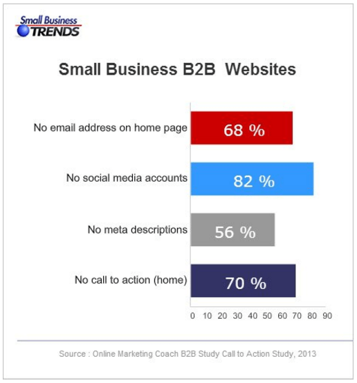
A study by Small Biz Trend revealed that, 70% of small business B2B websites lack a call to action.
Creating a High Converting Call to Action Button That Works
Believe it or not, crafting a call to action button that will compel your visitors to take the immediate action isn’t an easy task. Today, I will explain nine simple tips to simplify the task for you.
Let’s get started!
#1. Use actionable text for a killer call to action!
The text of your call to action button should be action-oriented and striking. Your button text should answer the following questions-
- Why people should click on your CTA button?
- What will happen after clicking on it?
Don’t just use the boring words like Submit, Enter, Go, etc. as a CTA button text.
The CTA button text should start with an action verb. Let me show you some of the possible options here-
- Download Whitepaper
- Get My Free Quote
- Open My Account
- Reserve Your Seat
A small tweak in your Call To Action button text can increase your website conversion rate.
Don’t trust my words?
Firefox found 3.44% more conversions when they change the call to action button text from “Try Firefox 3” to “Download Now – Free”.
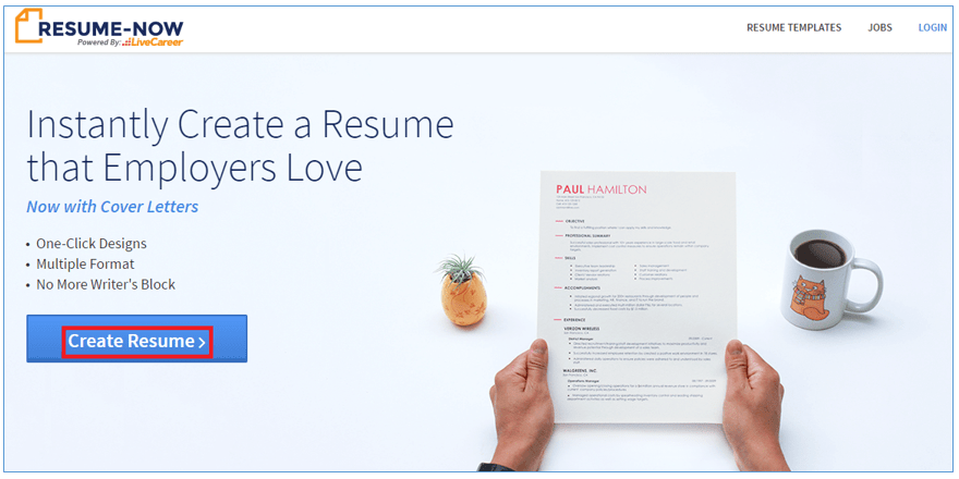
Just take a look at the screen below from Resume-Now. This is an online resume making website. They are using ‘Create Resume’ as a CTA button text. The button text is clearly indicating why you should click and what will happen after clicking.
#2. Choose a color that stands out
First of all, your CTA button should be a color, not white, black or grey. Secondly, it should be a color that stands out. You need to give a careful consideration to your CTA button color.
There is no particular color that performs better. Generally speaking, blue and orange color buttons are reported to perform best.
My recommendation is to choose a color that makes your CTA button stand out from the rest of the page. The button color must be contrasting with the background color.
For example, if you use blue CTA button on a blue background, then it will be hard for the visitors to recognize your call to action button.
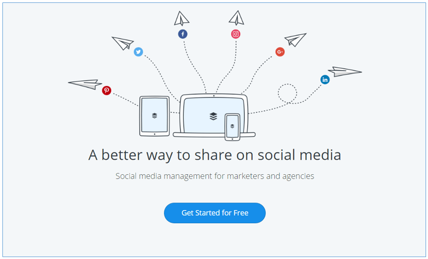
But, if you use blue CTA button on a white background, then the button will stand out. Buffer uses this perfect combination.
#3. Size your Call To Action button perfectly
Size matters when it comes CTA button. Go for the standard size that makes sense and don’t make it too big or too small.
Sure you want the visitors to recognize the button easily but using the too big button can work negatively. Because, it can make your overall layout a messy look and people will overlook the rest of page content simply because they can’t get past the CTA size.
Here is a proof of making a CTA button lot bigger actually found 10% decrease in conversion.

Conversely, if you make your button too small, then the visitors may overlook your CTA.
Therefore, the call to action button needs to be big enough to click comfortably, but not too big that it looks strange.
#4. CTA Button Shape
There are two most common and popular shapes people use for CTA button. They are rectangular and rounded.
Nobody can tell you what shape will work best for your website as both are popular and both can perform well in different settings. Now, you need to decide whether you want to use a button with rectangular shape or rounded shape.
Ultimately, you will need to test the both shapes and see what works best for your business!
In ContentVerve’s test, a rounded button performed better than a rectangular shape.

#5. Use directional cues in your CTA Button
Directional cues help to guide the visitor’s attention to your call to action button. Directional cues can be both an eye direction of a face or an arrow that points directly to your call to action button.
After arriving the visitors on your site they actually don’t know what action you want them to take. So, give them a clue what you want them to do by using directional cues.
Some people say it’s rude to point but it works well for conversion as it gives a sense of direction to concentrate and look on the more important aspect of your page, which is the call to action.
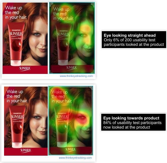
A neat example is taken from whatusersdo — the woman’s eyes guide people on where to focus.

And here is another great example that our friend Perry Belcher recently shared on Facebook. This example does not refer to a Call To Action button – but still a fascinating study and a powerful endorsement of the use of directional cues!
#6. When creating a CTA – go with the first person
A study by Michael Aagard found that changing the button text from second person (start your free 30 day trial) to first person (start my free 30 day trial) resulted in a 90% increase in CTR.
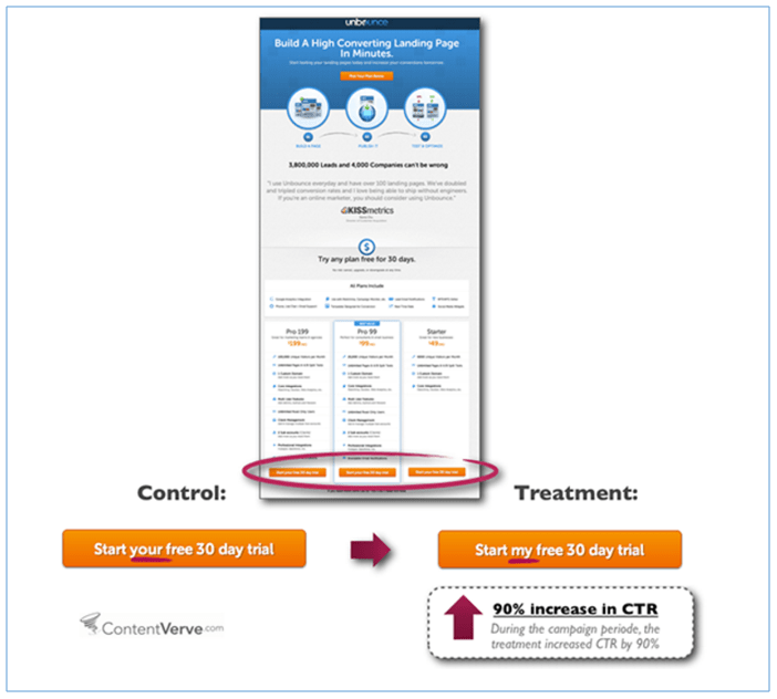
You know why the first person does perform well?
Because, using the words like “me” “my” and “mine” make the visitors feel that you are addressing them directly.
Still, if you want to go for the second person, then test it against the first person to check which one perform better.
Remember, you are targeting real human beings and if you can’t personalize your message then they won’t take your desired action.
#7. Bonus Text
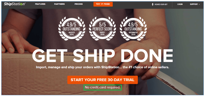
Adding an extra bit information within or below the CTA button can reduce the anxiety of the users. This extra bit of information may not be fit with every CTA button, but when it fits, it works very well.
For example, Shipstation using ‘Start your free 30-day trial’ as a button text and a smaller text ‘no credit card required’ beneath the CTA button which reduces the anxiety of the visitors that they don’t have provide their credit card information.
This valuable info will also encourage the users to click through to start their trial.
#8. Your Call To Action Should Be Urgent
Your call to action button should create the urgency so that your visitors take an immediate action.
You can simply do this by conveying a message that your audience will miss a great opportunity if they don’t click on your CTA button.
There are some common words (i.e. today, now or immediately) you can use in your CTA to create the sense of urgency. These words imply a greater urgency and make it clear to your visitors that the offer may not last forever.
For example, you may use a button copy like ‘Sign Up today and get 20% off!’
#9. Frame your CTA button inside a white box.
Framing the call to action button inside a rectangular white box is another excellent way to detach the CTA button from other elements on the page and make it stand out.
If your CTA button is cluttered up with surrounding content, then it will be lost with other elements in the page.
Make sure that you balance the CTA white framing with your page design. It needs to stand out – but not in a bad way! Avoid anything tacky and amateurish.
The CTA does not necessarily have to be framed by a white box – other colors are available, but in most instances, white works best.
Instapage is a good example of how to do it well.

Final Thoughts:
The above nine tips are a great framework that will allow you to create a powerful Call To Action Button.
But to discover the perfect Call To Action button for your niche, you must split test!
Without split testing your CTA, you will never know if you are doing your best.
For example if we take point #4 (button shape) – there are two common button shapes used – rounded and rectangular. Both shapes perform well. But you still need to split test it in order to find out the best shape for your industry / niche.
Same goes with the button color. Some people will say orange color button performs well and others will say a blue color button performs better. A/B split testing is the only way of telling for sure what works best for you.
And finally, always keep this simple formula in mind:
The CTA button should be simple enough so that the visitors can easily understand your message and compelling enough to persuade them to click on it.
Author Bio: Jabed Hasan is a Content Marketing Manager at Mountnow.
FAQ about increasing call-to-action button conversion rates
Why is it essential to increase call-to-action button conversion rates?
Call to action (CTA) buttons are a crucial part of any website. They serve as the gateway to getting visitors to take the desired action, such as making a purchase, subscribing to a newsletter, or filling out a form. By increasing the conversion rate of your CTA buttons, you can potentially generate more leads, increase sales, and ultimately boost your business’s revenue.
What are some best practices for designing effective CTA buttons?
Here are some best practices for designing effective CTA buttons:
– Use action-oriented language that clearly communicates the benefit of clicking the button
– Make the button stand out visually by using contrasting colours, bold text, or an eye-catching design
– Make sure the button is easy to find and prominently displayed on the page
– Use a clear and concise message that aligns with the overall goal of the page or campaign
– Test different variations of the button to see which one performs best.
How do you test the effectiveness of CTA buttons?
One way to test the effectiveness of CTA buttons is through A/B testing. This involves creating two versions of the same page with different variations of the CTA button. Half of your traffic is shown one version of the page, and the other half is shown the other. By tracking the conversion rates of each version, you can determine which button is more effective and make changes accordingly.
What are some common mistakes to avoid when designing CTA buttons?
Here are some common mistakes to avoid when designing CTA buttons:
– Using vague or unclear language that doesn’t clearly communicate the benefit of clicking the button
– Making the button too small or hard to find on the page
– Using a design that blends in with the rest of the page and doesn’t stand out
– Including too many CTAs on the same page, which can be overwhelming for visitors
– Not testing different variations to see which one performs best.
I hope that helps! Let me know if you have any other questions.

Check out our must read articles about Make Money Online:
-

14 Ways To Make Money With a Website -

The Ultimate Guide to Monetizing Your Blog in 2024 -
Best Ways To Increase Sales On Your Website Using AI -
10 Ways SamCart Will Increase Your Checkout Page Conversions -
11 Affiliate Marketing Mistakes You Must Not Make -
The Best Website Broker for 2024 -
9 Things Most Sales Pages Are Missing (fix these today to increase conversions!) -
10 Reasons Why SamCart is the Ultimate Shopping Cart Solution


")
