
30 Great Examples of Blog Post Styling
Last week I spotlighted 30 of the internet’s best designed blogs.
A brilliant header, clean sidebar, and minimalist footer can go a long way towards making a blog look good. But the one area that’s often overlooked in blog design is the post styling.
Blog Post Styling: Enhancing the Visual Appeal
Here are 15 blog post areas that need styling and 30 great examples for you to draw inspiration from.
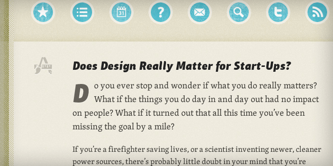
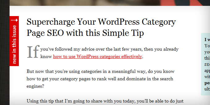
Headlines
The headline should be the first thing they’ll see. The headline and post image needs to work together with the goal of enticing the visitor to read the first line of the post.
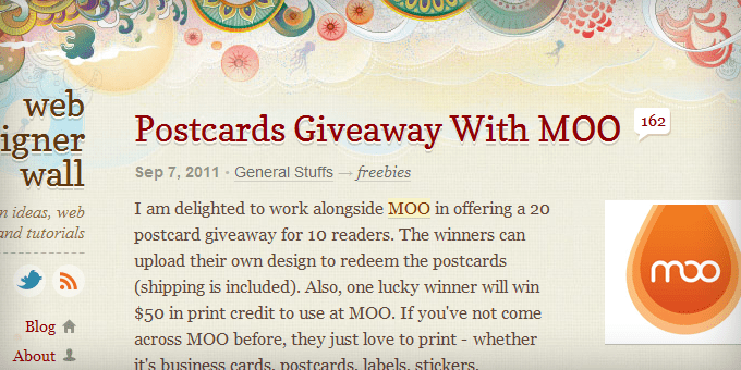
WebDesignerWall.com
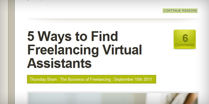 FreelanceSwitch.com
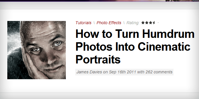
Post Images
If not the headline, the post image is the first part of the post that people see. It needs to attract their attention first, curiosity second.

Breadcrumbs
Breadcrumbs help with navigation and SEO, but most of the time their ugly and unnecessary for people who frequent your site. You want the breadcrumbs to sink into the background of the design so your readers naturally glance over them but they’re easy to find if someone is looking for them.
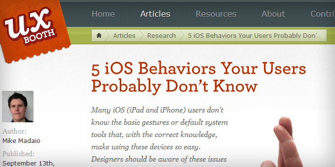
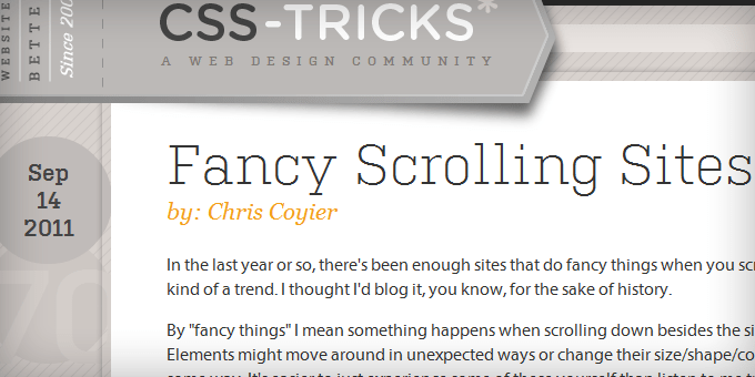
Meta Data
Like the breadcrumbs, you want the meta data (i.e. published on date, post author, category, etc.) to be worked into the design so it doesn’t stick out.
 VisitMix.com
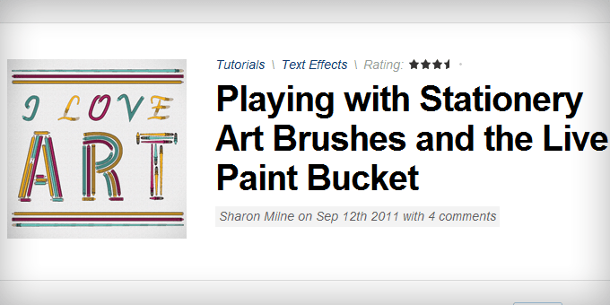
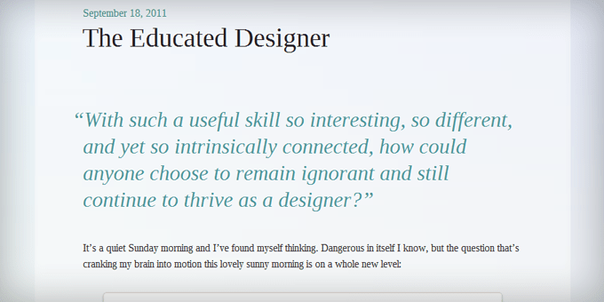
Drop Caps
The point of the drop cap is to immediately draw your readers’ attention to the start of the post. Magazines and newspapers use this all the time and I think more blogs should do it as well.
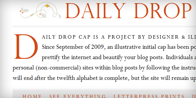 DailyDropCap.com
 AttackofDesign.com
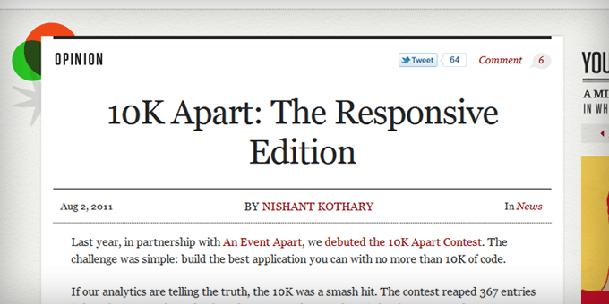
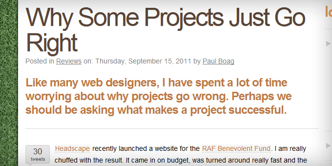
Intro Text
The intro text should be slightly larger and easier to read than the rest of the content so it eases your readers into the post. Magazines use this technique in conjunction with the drop cap to lure in the reader in such a way that it’s hard to stop reading. It’s also called the lead.
 Xheight.co.uk
Typography
Typography’s main function is to make the content easy to read. Most major news sites (i.e. CNN.com, AOL.com, MSNBC.com, and Mashable.com) use Arial because it’s widely considered as the web’s most readable font. But Arial isn’t perfect for every blog.
Subheadings
The point of a subheading is to make your content scannable. These need to be styled so they stick out and break up the content. A good subheading has the same effect as an image within a post.
 FreelanceSwitch.com
 DesignInformer.com
Bullets
Bulleted lists are another way to break up your content. With a little CSS magic you can use any image you want as the bullet.
 FreelanceSwitch.com
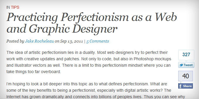
Blockquotes
Blockquotes are traditionally used to display, you guessed it, quotes. But some sites have started to use this formatting to draw attention to a certain part of the post to try to get you to stop scanning and read the whole thing. This is the magazine equivalent of a call out.
 Blogussion.com
Social Areas
In order to convince people to share your content, you need to style the social sharing areas so they’re obvious and remind the reader to share. I’m a big fan of the sliding social areas that sit in the left margin.
Subscribe/Calls to Action
Every blog post needs to have a call to action. One of the more popular calls to action is to subscribe to your RSS feed or newsletter. It should be the most prominent area at the bottom of every blog post.
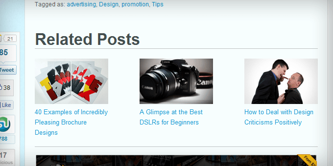
Related Posts
Listing the related posts at the bottom of your blog posts is one of the best ways to convince people to stay on your site. To maximize attention-grabbing and curiosity-inducing, this area should include the headline and the post image for each related post.
Post Authors
The post author section is a nice way to introduce who wrote the post while making it easy for the reader to connect with that person.
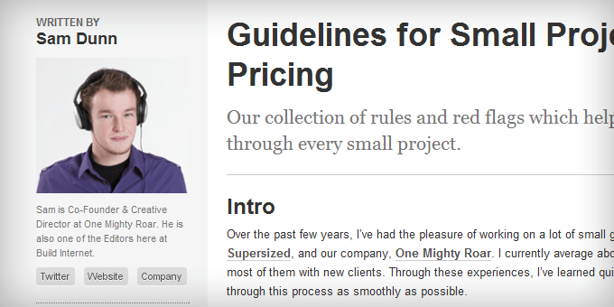 BuildInternet.com
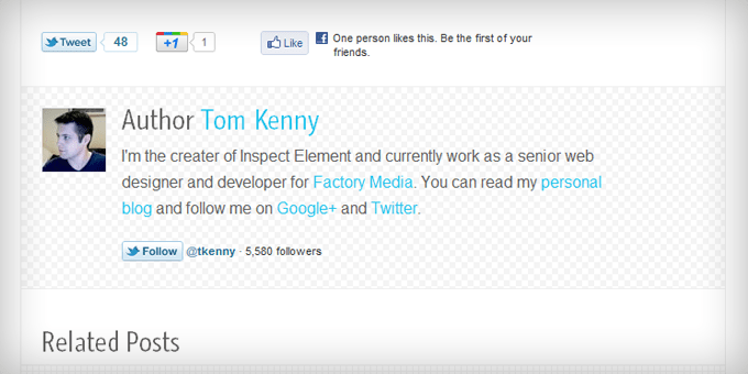 InspectElement.com
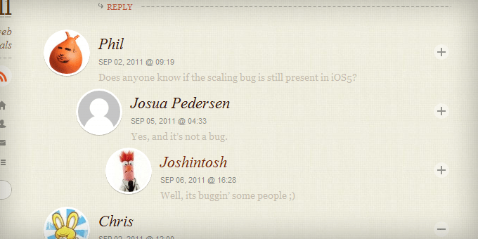
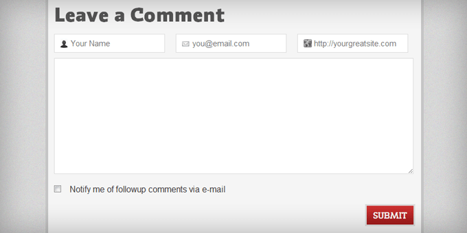
Comment Areas
A nicely designed comments section goes a long way towards encouraging your readers to leave comments. The number of comments, comments, and comment form need to work together. And the comments should be nested so it’s easy to follow conversations.
 Blogussion.com
The Wrap-Up
Since the post area is where most of your visitors’ time is spent, I believe it’s the most important area of the design to focus on.
I hope I’ve opened your eyes to the importance of blog post styling and all the creative ways you can style these 15 elements to encourage readers to spend more time on your blog.
See More Articles Related To Entrepreneurship
-

How Elon Musk’s Net Worth Got to $245 Billion -
See how much traffic your competitors are getting. -
How Mark Zuckerberg’s Net Worth Got To $200 Billion -
15 Business Lessons from Amazon’s Jeff Bezos -
21 Life Lessons from Steve Jobs -
Mark Cuban: 10 Winning Lessons from this Maverick Entrepreneur -
FatJoe: SEO Services and Article Writing -
11 Life-Changing Business Lessons from Zig Ziglar -
Richard Branson: 15 Lessons For Business Success -
Business Mastermind Groups: 17 Reasons Why You Should Join One -
How to Be Like Mike: 21 Life Lessons from Michael Jordan -
How To Create And Live Your Perfect Day -
How To Become An Entrepreneur (lessons from $10mil in sales) -
25 Ways You Can Increase Trust On Your Website -
20 Rules For Business Success (from millions in sales, social media views and visitors) -
21 Key Principles For Success In Modern Business -
11 Ways To Fake It Until You Make It -
11 Secrets to a Happy Entrepreneurial Life -
25 Lessons, Quotes, and Productivity Tips from WordPress Founder Matthew Mullenweg -
Responsive Web Design: 15 Best Practices


")

")


Excellent post, some great resources. Styling your blog the right way is key. Yet people keep using crappy free themes and bad fonts and everything else you mentioned.
You really did note down every little detail, got some changing to do!
I’m glad you have some changing to do, Jamie! That was the goal of this article.
Great Post, are you able to give some of the names of the plugins that you use to create the look for the following websites
WebDesignerWall.com
DailyDropCap.com
QuickSprout.com
Hongkiat.com
Bryan – Turbo Fitness Secrets
Hey Bryan… As far as I know, those are all highly custom designs. You can’t get that with plugins. I know QuickSprout is built on the Thesis theme. Not sure about the others.
Sweet post. it’s about sweating the details!
I also love the title of your book. Are you making more than your parents yet?
Mark
Nah, not yet ;).
To say you don’t seem like the web designer type, you have an eye for it. Weird…
Good post Nicolas, there are definitely some things that we can learn from other blog post styling.
Very nice post Nicholas. This is a great reminder that there is always room for improvement. Thanks for the great examples and inspiration!
B
Nice post on blog post styling
🙂
Excellent post providing a whole range of formatting and styling ideas, thanks Nicholas. Probably won’t be able to implement everything on the list but just raising awareness of what can done and itemising a few ‘to do’s’ will help.
I love the way u show all the post.Anyway good post.Thumbs up !!!!
I like the pro blogger lot and the gizmodo.
nice share. Really love those samples. I might try it out soon. than you
Some gorgeous designs here. You have given me a lot of inspiration to make changes on my blog, which has a way to go before it becomes as elegant and clean as I hope it to be someday.
-Steve
Thank you Nicholas for reminding me of the Drop Cap concept.
I think I’ve got a plugin that makes this happen smooth that I haven’t been using.
The visitmix way of showing By: and Category is also super smooth.
This post is definitely a keeper and should be a smash among serious bloggers! Thank you for taking to time to screen shot all this stuff and for giving your opinion on them and why you believe they work.
You’re welcome, Lewis. I’m glad I’ve created a resource that smart bloggers can use.
thanks Nicholas i think i will borrow a leaf from those flashy ideas 🙂
Great post, Nickolas.
You have provided quite a bit of food for thought, as far as different ways of adding some nice changes to your blog.
I have seen some amazing Blog(Website)template designs. There are many that are available free.
It’s always refreshing to see people spicing up their blogs a bit by adding some of their unique character into their site.
As far as widgets go, WordPress is quite incredible with the number and variety they provide. (I hope to make the switch over soon).
What’s a useful post, Nickolas! I hope i can improve my blog style using these tips.
Thanks
I absolutely loved reading this post. It is informative, completely comprehensive and straight to the point. well done Nickolas and thank you.