
10 Design Elements All Big Blogs Have In Common
Anytime you create something new, whether it’s a product, a service, or a website, start by taking a look at what others have created before you.
To help you set the foundation for your blog design, I’ve listed 10 design elements that almost all big blogs have in common and how you can implement them on your WordPress blog.
The 10 Big Blogs
To give you some hard data, I chose to use Mashable, TechCrunch, The Next Web, GigaOM, Seth’s Blog, Copyblogger, Problogger, KISSmetrics Blog, Freelance Switch, and The Oatmeal as examples for this post.
Header
The headers on nine out of ten of these sites were 100 pixels high or less. Most of them included the logo and a search bar.
Logo (10/10)
All ten of these blogs had their logo in the upper-left corner and hyperlinked it to the home page.
The GigaOM.com logo is in the upper left and it links to the homepage.
How to implement the hyperlinked logo: Most WordPress themes (i.e. WooThemes, Thesis, Genesis, etc.) let you upload a logo through the theme’s design settings and it automatically links home.
Search Box (6/10)
Six of the ten big blogs had a search box on the right side of the header. Seth’s Blog and Copyblogger put their search bar towards the top of the sidebar. The KISSmetrics blog and The Oatmeal don’t have a search mechanism.
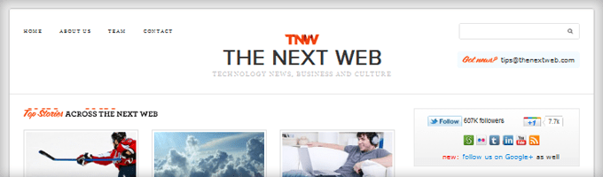
TheNextWeb.com’s search box is on the right side of the header.
How to implement the search box: You can place your search bar as a widget in the Appearance > Widgets area of your theme. If you don’t have a widgetized header, this is the php for the search box:
<?php get_search_form(); ?>
Place it within your header.php or your theme’s custom php file. If you’re not familiar with php, put it near the top of your sidebar within the widgets area.
Content Area
Eight out of the ten big blogs feature the content area on the left and the sidebar on the right. Here are a few more common design elements within the content area.
Social Buttons (Slider) (10/10)
All of the big blogs include social sharing buttons with Facebook’s Like/Share and Twitter’s Tweet being the most popular. Google’s +1 and LinkedIn’s Share buttons are also popular. Digg, StumbleUpon, and Reddit buttons aren’t listed as often as they used to be.
Both Mashable and TechCrunch have social sliders on the left side of the content that slide down as you scroll down the page. IncomeDiary has this too.

TechCrunch.com’s sharing icons are in the left margin and they scroll down the page.
How to implement the social buttons: If you prefer not to hardcode the buttons into your theme, I recommend the Like, Easy Twitter Button and WordPress Google +1 Button plugins. Use the Sharebar plugin to put a scrolling social slider on the left side of your content.
Related Posts (7/10)
Seven out of the ten of those blogs feature a related posts area at the bottom of every post. This encourages people to read more of your articles, spend more time on your site, and become more engaged with your blog or business.
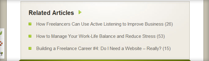
FreelanceSwitch.com features three related posts at the bottom of every post.
How to implement the related posts: I whole-heartedly endorse Rob Marsh’s Similar Posts plugin. You’ll also need the Post-Plugin Library plugin to get his series of plugins to work on your site.
Post Footer Call To Action (5/10)
Half of the big blogs have a very specific call to action at the bottom of the post. Usually the call to action is to subscribe or purchase.
The other five blogs just encourage you to share, comment, or click on an ad. One way or another, they all have a call to action.
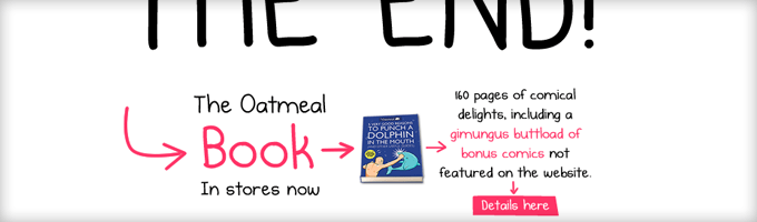
TheOatmeal.com’s call to action is usually to buy The Oatmeal book.
How to implement the post footer call to action: Since every theme works differently, it’s hard to give specific instructions here. All you have to do is hook a slab of HTML into your theme at the bottom of your content area and above the comments area.
Sidebar
The sidebar is usually about half the width of the content area, and as I mentioned previously, most sidebars are on the right.
Sidebar Opt-In (8/10)
Eight out of the ten of these sites have an opt-in within their sidebars and five of them are at the top. The words Free Updates and Subscribe are the most prevalent headlines and calls to action.
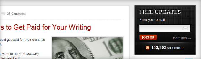
Copyblogger.com’s opt-in is at the top of the sidebar with the headline, FREE UPDATES, and the call to action, JOIN US.
How to implement the sidebar opt-in: Every major email marketing provider has some sort of a form builder that spits out HTML. Embed the HTML in a text widget and put it at the top of your sidebar. You might have to play around with the CSS to get it looking the way you want.
Popular Posts (7/10)
Featuring your popular posts is a great way to introduce a new visitor to the best content on your blog. Seven out of the ten promote their most popular posts in their sidebar.
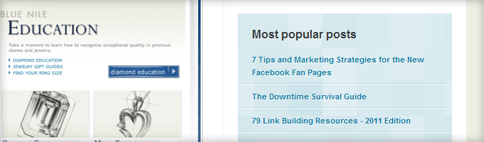
The KISSmetrics Blog features their popular posts in their sidebar.
How to implement popular posts: Use Rob Marsh’s Popular Post plugin to showcase your most viewed posts. Install the plugin and you’ll find a “Popular Posts +” widget that you can simply drag and drop into your sidebar.
Social Media Links (9/10)
Nine out of the ten blogs feature links to their social media profiles with Twitter and Facebook being the most popular. Other notables are YouTube, LinkedIn, StumbleUpon, Flickr, and Tumblr.
Mashable.com’s sidebar features the Like Box, +1, Follow, LinkedIn, YouTube, Stumble, and RSS.
How to implement the social media links: You can create a Facebook Like Box here. Or you can get free social media icons to make your own buttons here.
Products/Ads (9/10)
Nine out of the ten promote either their products or advertisements on the sidebar, and five of them feature both. The only reason TheOatmeal.com doesn’t is because he features the products primarily as the call to action.
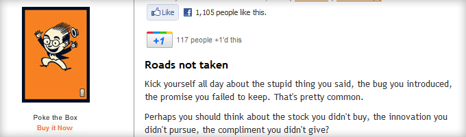
Seth Godin lists all of his books on his sidebar with the latest at the top.
How to add products and ads: Featuring your products on the sidebar is as simple as writing up the HTML and placing it in an arbitrary text widget. To feature rotating ads on your sidebar, I recommend the OIOpublisher plugin.
Footer
Traditionally, the footer was used as a place to list links to every nook and cranny of your website. But most sites are now opting for a more minimalist design with their footers.
Categories or Other Links (5/10)
Out of the five big blogs that have a more robust footer, they all list either category links or other links as an extra navigation menu area.
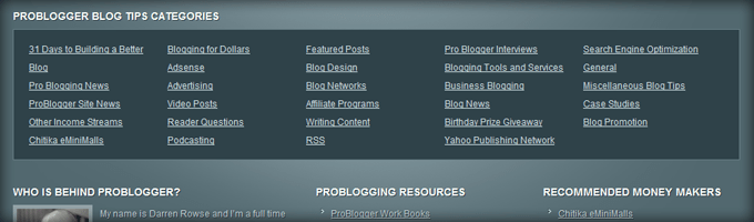
Problogger.net lists all of their categories in their footer to help visitors navigate the content.
How to implement footer links: A lot of WordPress themes have widgetized footers. If yours does, use the Text widget to place HTML within your footer. Similar to the post footer call to action, it’s hard to give detailed instructions here because every theme is different.
More Questions?
If you’d like more advanced tips around how to implement these design elements into your blog or specific themes, leave a comment below and I’ll point you in the right direction.
Read more: ‘13 Expert-Level Blog Design Tips for Beginners’

Check out our must read articles about Build Better Websites:
-

18 Website Optimization Strategies to Boost Sales and Traffic -
11 Essential Lessons From Going Into Business With People -
25 Ways You Can Increase Trust On Your Website -
24 Ways to Improve Your Website in 2024: Expert Tips for Success -
16 Ways to Speed Up Your WordPress Website Today! -
5 Design Features Guaranteed to Boost Sales and Conversions -
15 Best Practices for Responsible Responsive Web Design -
18 Things Making Your Website Slow


Thanks Nicholas that was a lot of great information. It is nice to know how some of the best blogs are put together.
You’re welcome, David. Some things need to be innovated while others should be imitated. Each of those ten design elements are consistent for a reason.
Nice list, most my blogs have about 7-8 of those elements, I’ll see what’s missing and make some adjustments. If they are doing it there must be a reason 😉
Right-y-o, Jamie! Thanks for being a regular commenter here. We all appreciate it.
Nicky the Tart
Another winner!
How much time do you spend online every day? Your research is pretty impressive
Cheers
Mark
Mark the Aly Ward! Oh, I spend a good portion of most days on the internet. I live in Colorado, so it’s hard to stay inside for too long. My mind is wired to look at things and instead of consuming the message, it figures out the why and how a message is delivered. Good for this stuff. Bad for comprehending things.
hey nick, believe it or not, this is a way awesome post. it got me inspired, never a site like oatmeal existed. you rock man, really! i’m tweeting this right away
Hey, thanks Victor! For every minute you spend reading The Oatmeal’s comics, spend two minutes figuring out why his stuff goes viral every time and how he’s making money with that traffic. There’s a lot to learn on his site, other than grammar tips of course ;).
God write up and a good collection of blogs ! have added a few of them to my google reader 🙂
I’m glad, Amit. I’m subscribed to a few of them as well.
Hi,
was wondering how did you use Similar Posts to put your “related post tab” after the post and before the comment?
and how did you use the other post-plugin-library plugins to make a tab on your 3 bar with 3 category?
Placing the Similar Posts is different for every theme. Do you use a premium theme? If so, which one?
And I’m not sure how Michael created the Inspiration-Interviews-Guide lists in the sidebar. Is that what you were referring to?
Im using headway, still testing around with it.
Yes, the inspiration-interviews-guide. Because Michael mention about the popular blog post, but i think it would be more awesome if i can do a popular-inteviews-most recent or something similar to that.
thx for taking the time to answer my questions 🙂
Hi Nicholas,
thanks for the case of study 😀 I’m glad I implement all of them (except for the search bar which I have at the side bottom).
BTW, you repeated “How to implement the search bar:” more than once 🙂
cheers!
Good eye, Dennis! Fixed it. Un abrazo, Nick.
Nice to know. Ten Big Blogs can’t be wrong 🙂
That’s what I figured, JP. Most of those things have probably been A/B tested thousands if not millions of times.
Hi Nick,
I am glad someone with your background wrote about this. I am constantly reminding myself and my clients those little things that are important to make the site better.
This will help me by sending them the post and since it is inside incomediary.com a very reputable site they won’t stand a chance if they want to argue …. 🙂
To Your Success
Haha! I thought about not including the “logo in the upper left” portion because surely everyone knows this is a web standard. But my buddy had a client specifically demand to put the logo in the upper right.
Ooh, and then they’re read your comment and think, “Gabriel premeditated this.”
Its a great lesson indeed. But my problem is that i don’t know where to paste those things like the php of my search box. And assuming i want something to appear on a particular side of my website, how and where do i paste the embedded code to appear to my desired location?
Hey Theodore. It really is different for every theme. If you’d like to put something in the sidebar, use the Appearance > Widgets area. Otherwise, I don’t want to guess because it could bring your whole site down. Which theme are you using?
Dammit Nick how’s you get so smart dawg, your to young to be that smart, this is gr3eat stuff man. thanks, I’ll probably be emailing you….
Thanks, Bigdaddydok! If your emails are anything like your comments, I’ll be looking forward to it ;).
I’m getting ready to self-host a blog; thank you for this presentation …very helpful !
Sure thing, Christin! Remember to use Michael’s HostGator coupon, “Retireat21” if you host with HostGator, which you should.
woow thanks Tart, this is great post with great insight. Logos are in the upper left corner, like that.
Yeah, that’s like internet law. Glad I could help.
Best advice for blog styling!!! Got some nice ideas and advice for testing conversions. It makes sense that these blogs have high converting content too for example all there beautiful images and clean design factors.
Thanks for the post Nicholas Tart
JanDirk
Sure thing, JanDirk. Here’s a relevant quote from Sir Isaac Newton: “If I have seen further it is only by standing on the shoulders of giants.”
Hi Nick
Thanks for your reply. The Theme I’m using is Buano a free wootheme.
I just need to work on my sidebar, it is getting more tough for me to get that done.. hope it will be done very soon..
I know what you mean, Rajesh. A lot of work goes into designing every element of your site.
Thank you for these pointers, seems like I am on the right track save for the first point. I need to look into that.
Hey Nicholas thanks for the tip. I really enjoyed the advice about the content area and side bar.
You’re welcome, Matt.
What a brilliant post! So simple yet effective, I’m right now checking most of the plugins you posted, the scrolling social media widget and related posts have been on my mind for a long time, I hope it’ll all work properly.
Really a neat idea to do, those blogs surely can’t be wrong with what they do!
Well, I hope you finally implement those two things on your blog, Chio! It’s great to hear that the article is inspiring and brilliant, but I really want to hear that people are implementing the advice here and how it’s making a difference.
Great post I spent many hours studying what the most important elements of a blog are. The biggest problem I see with new/smaller blogs is overcrowding. They add way too many banners, ads, widgets and other stuff that is really not needed at all and takes away from the content.
Keep it simple!
I agree, Gino. Blogs that add banner ads from the outset don’t have a chance. I’ve always heard that you should advertise on your site until you have 5K daily uniques. Until that point, the pixel space is worth more than you can earn from the ads.
Thanks for this guide. I just grabbed my name
for a domain name and wanted a guide on proper
layouts for monetizing my content.
Saved me some researching 🙂
~G
I was wondering if when creating a blog if using website software such as Web Easy 8 would be beneficial since I have little or no html knowledge? What would you recommend?